Smith, Application Essay, 2014
1 Smith, Nike Conquer, Digital Media & Inkjet Print on Card Stock, 20" x 24", Self-Directed, 2014
2 Smith, Lava, Digital Media & Inkjet Print, 20" x 24", Final Project for Experimental Type - printed a poster for project however poster is not shown here, 2013
3 Smith, Jeep Sachplakat, Digital Media & Laser Print, 11" x 17", Project for Design Theory, 2014
4 Smith, Top 4 Touchdown Passers of All Time, Inkjet Print on Cardstock, 8.5" x 11", Publication Design for Experimental Typography, 2013
5 Smith, My Hotels, Digital Media, Self-Directed, 2014
6 Smith, directionoflava.com, Digital Media/Web Design, Website for Design for the Web, 2013
7 Smith, Graduation Invitation, Photography & Inkjet Print on Card Stock, 3.5" x 8", Self-Directed, 2013
8 Smith, Buck Camo, Lead/Ink, Digital Media & Laser Prints, 11" x 17" presentation print, Project for Visual Communications, 2014
9 Smith, Photography Final, Photography & Photo Prints, 8" x 10", Color Photography Project, 2013
10 Smith, Elite Masonry & Construction Lettermark, Vector Image/Inkjet Print on Cardstock, 15" x 15", project for Experimental Typography, 2013
11 Smith, Sketchbook Images, Charcoal and Conte on Paper, All Roughly 5" x 8", Sketches for Drawing I, 2012
12 Smith, "Untitled", Woodcut, 13" x 11", Project for Printmaking I (Color Print Self-Directed), 2013
13 Smith, Scholarship Application Essay
Link to Scholarship Application Essay

Thursday, February 6, 2014
Wednesday, February 5, 2014
1 Jeff Smith BFA: Nike Conquer


Inspiration, Sketch, & Color Study


In Design Theory, we did a project where we needed to create a Sachplakat style object poster. One of my original ideas was to do my poster about a Nike shoe. I chose to do a Jeep instead for the class but decided to do a self-directed, more contemporary object poster of the Nike shoe.
Tuesday, February 4, 2014
2 Jeff Smith BFA: Lava


In Experimental Type class, we were asked to do a final project. The project was pretty open as long as our projects were inspired by the work of a famous typographer. I chose to study Margo Chase and design a logo using her designs as inspiration. This is the identity I created for a surf/skateboard company called Lava. I also experimented with some branding for the company.
Monday, February 3, 2014
3 Jeff Smith BFA: Jeep Sachplakat


Sunday, February 2, 2014
4 Jeff Smith BFA: Top 4 Touchdown Passers of All Time


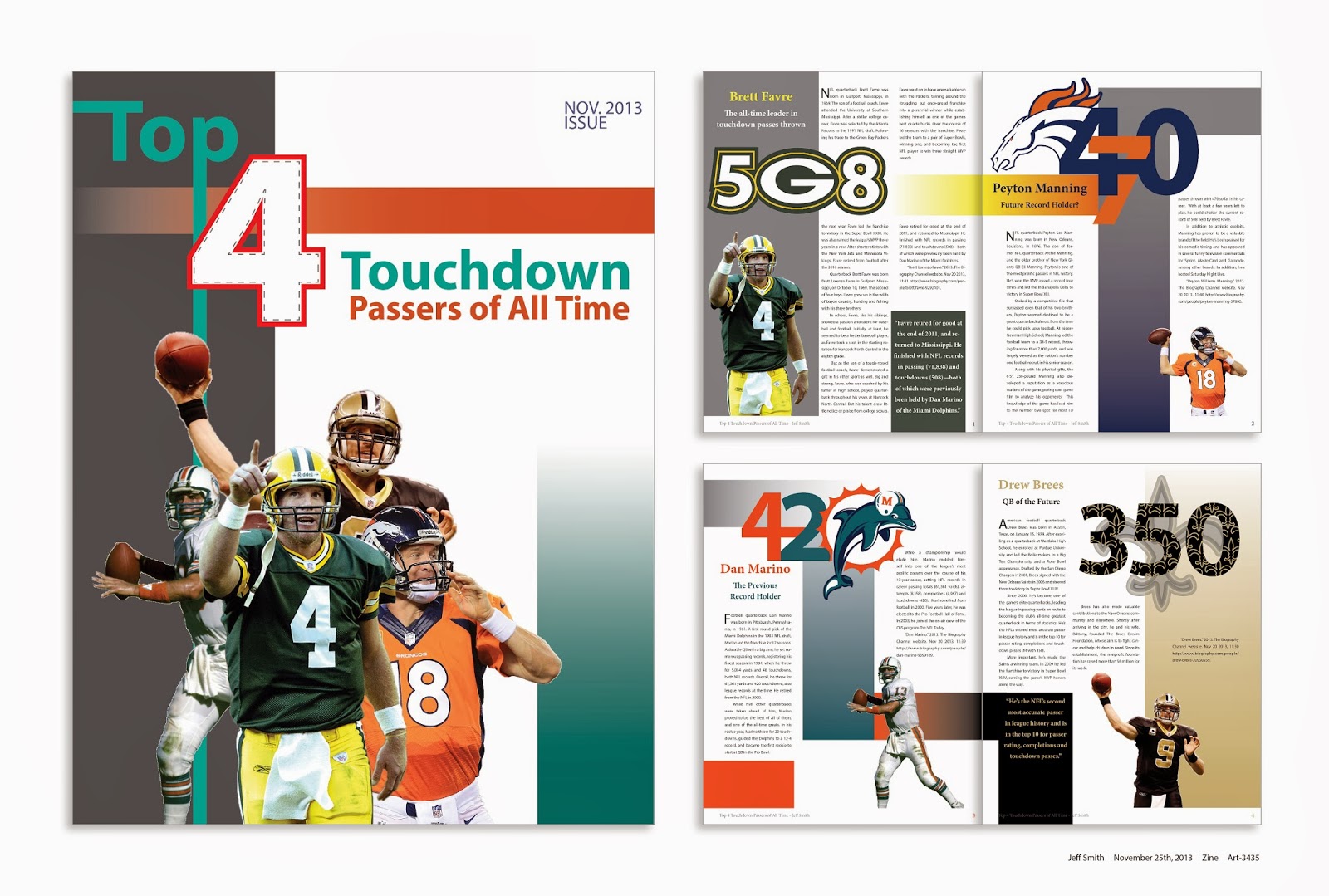


In Experimental Type, we were asked to create a four-page publication design plus a cover and we had to base the content off of significant numbers. I chose to design my publication around the record holders for number of touchdown passes thrown. This project taught me a lot about the anatomy of type, the difference between text and type, as well as many of the rules about publication typography.
Saturday, February 1, 2014
5 Jeff Smith BFA: My Hotels

Sketches/Studies
App Icon

App Screenshots

This design actually came to me really late one night when I had just laid down to bed. Luckily I got up out of bed and drew a quick sketch. This was a self-directed project in which I designed the identity for a made-up company which I titled, "My Hotels." This is a company that manages an app that allows people to view reviews on hotels, schedule a hotel stay, check-in to their hotels, rate the hotels they stay at, and keep a record of all of their hotel visits. I also created some branding of what the app icon might look like as well as what some of the app pages would look like.
Friday, January 31, 2014
6 Jeff Smith BFA: directionoflava.com


You already saw one Lava identity that I created...this was a logo design that stemmed from that same project but didn't really fit the mold for what I was doing. I liked this logo so much that I used it to create an identity for a completely different company and used that identity to create a website for Internet Design class. The company is a computer software company and the website is currently up and running. Feel free to click on the link or scan the QR code and check it out.
Thursday, January 30, 2014
7 Jeff Smith BFA: Graduation Invitation


My wife graduated in December and she asked me to design her graduation invitation. She had specific ideas of what she wanted and one of the examples she showed me had a large letter U that was made up of a bunch of smaller U's. I took inspiration from that to design the W that is on her graduation invitation.
Wednesday, January 29, 2014
8 Jeff Smith BFA: Buck Camo


Studies


This was a project for Visual Communications class. We had to choose an animal and reduce the animal to the basic shapes that are true to the animal's form. I chose to do a buck deer and this is my reduction. We then took that reduction, reduced it some more, and created a logotype and a company name.
Tuesday, January 28, 2014
9 Jeff Smith BFA: Photography Final


Monday, January 27, 2014
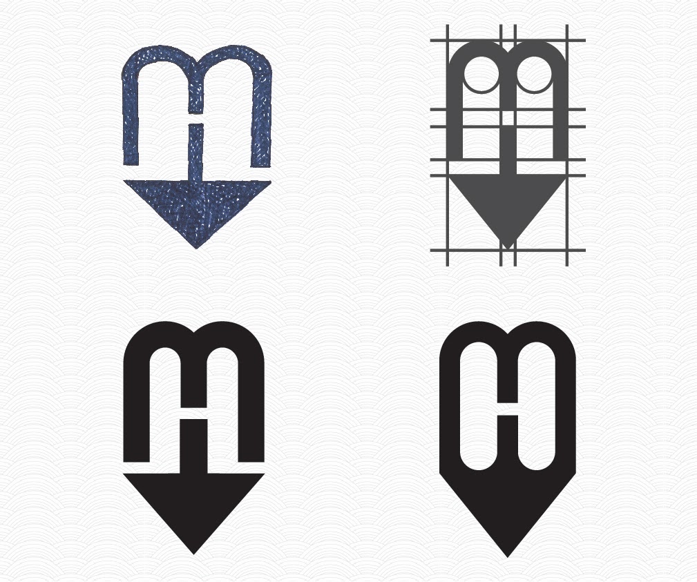
10 Jeff Smith BFA: Elite Masonry & Construction Lettermark


Studies

Elite Masonry & Construction is a small business on the East Coast. In Typography class, our assignment was to create a lettermark for a company whose current lettermark or logo needed a little work and I chose Elite. Our objectives were to create a lettermark that could be printed in black and white or color, was well-constructed, used typography to portray the company's message without using imagery, and had colors that represented the company. I chose the deep red to represent brick which is a common construction material and also to make the chimney stand out. I chose a neutral, yet unique shade of brown to represent neutral color schemes and building materials often used when constructing houses.
Subscribe to:
Comments (Atom)